
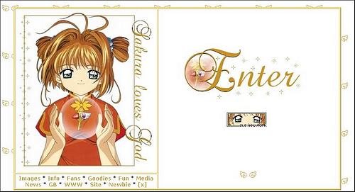
Layout Archives
Click thumbnails for full sized screencaptures- the archives date from the latest version back to approximately almost 3 years ago
Version 17 - Where's your head at?
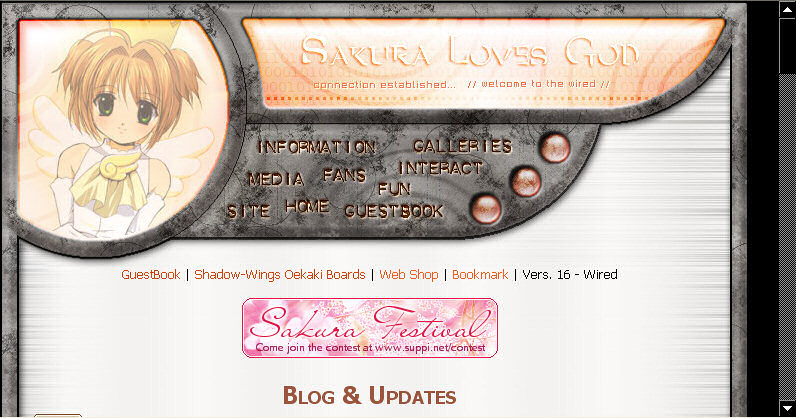
Version 16 - Wired. I really wanted a classy interface layout so for two or three months I followed tutorials and practiced interface elements (see edits). This must have taken at least 10 hours over two to three days. I am so happy with the way it came out: it was meant to be light silver but the sort of polished wood look gave it more warmth.The splash image Sakura panel has more glass details. Favorite part? the little round buttons.
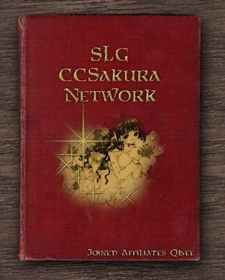
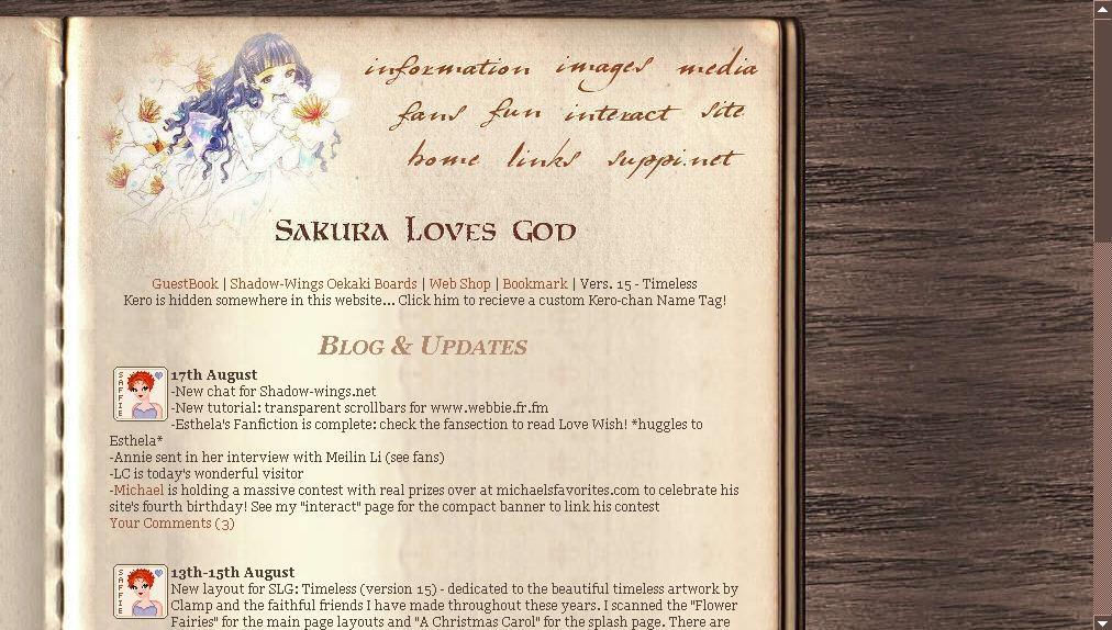
Version 15- Timeless. After much pondering and indecision over various Sakura images. lightening struck and I scanned in two of my oldest books: A Christmas Carol by Dickens and The Flower Fairies by Cecilia M Barker. Many hours of editing later: it was online but i still wasn't happy with the wooden suface and the book edges and so redid it and published the new permanent version (see above)
I'm particularly proud of this version as it's very ...different... the book cover splash came out especially nice with that dirty gold look (that took many layers). That and the fact mom loves it =p
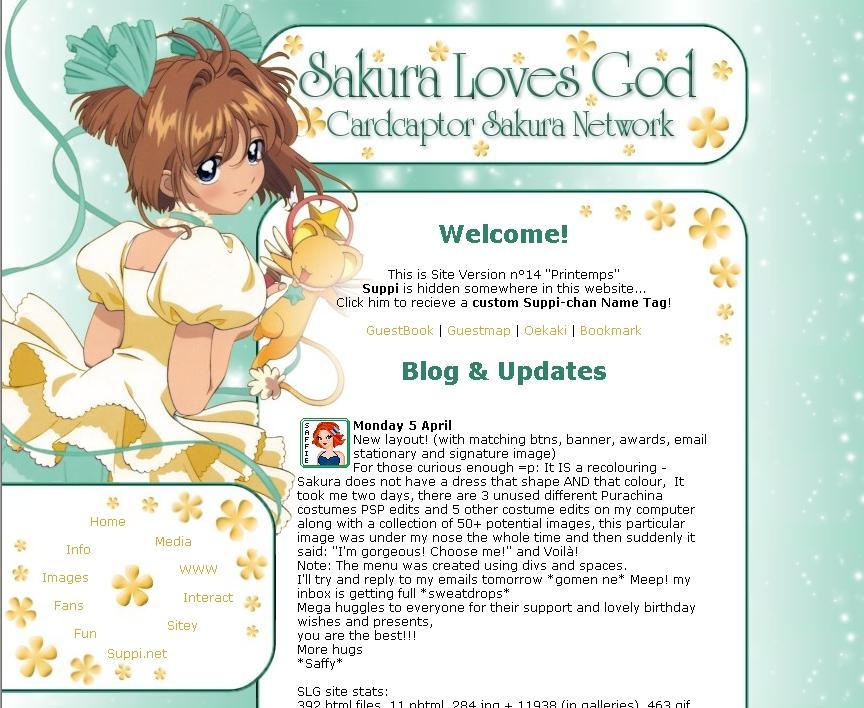
Version 14: Printemps -springtime- Another full recolour (ribbons, dress, eyes, skin) from the beautiful Purachina costume (blue+pink). This time I've got more experience in editing and the cut out was painstakingly checked (with a 1px erasor brush). The overall effect is a lot neater.The choice of colours was based on a wallpaper i created a few weeks earlier (another recolour) called the buttercup fairy.The menu uses the space tag and divs to create the circle effect. Special: Created awards, banner, buttons and email template/sig to match.
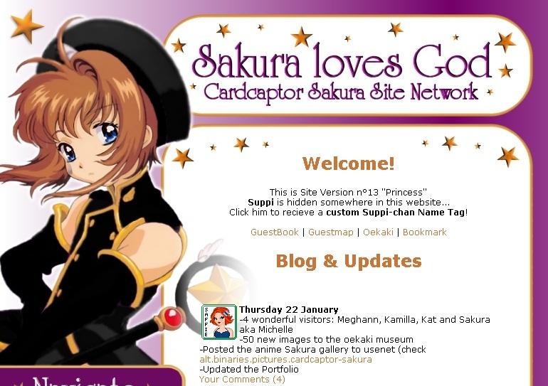
Princess version grief: created to express upset at losing Suppi being the last straw in a whole load of sad things happening in my offline life. I made the layout, put it up, blogged (public and private) cried a bit then got on with living as best as poss' again...
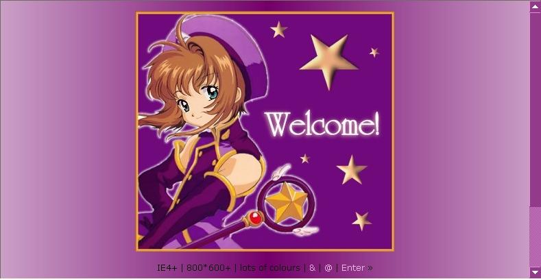
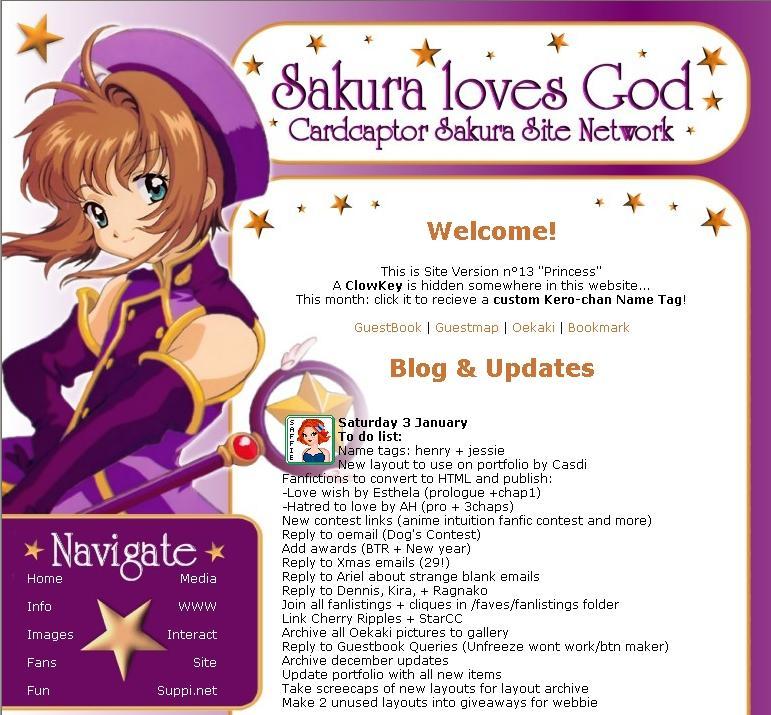
Princess: My favorite layout ever: elegant, original but simple: I colorized a pink outfit from the second movie in PSP, because i wanted that image but barbie pink just wouldnt do...now that royal purple is so gorgeous ^^
I also switched from SSI to javascript includes for better offline viewing and so the layout could be applied to all galleries (on free hosts) too
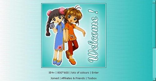
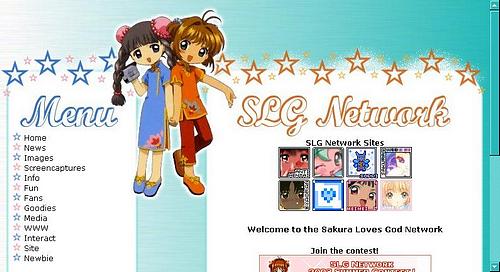
Genki Girls: Designed to be cute and restful on the eyes, I like this one ^_^
In the same concept as back to basics, traditional future was based on an image that i had when first starting my website.It was very cute but i didnt like the fuzziness of the kimono pic and the orange got on my nerves.First layout using PSP and Div layers.
Butterfly:Switch to HTML!!!!! First ever HTML/CSS layout.I was very proud of the side cinema images made with paint from screencaps.
Submitted to review sites and got critized badly because of the fuzziness of the splash image so switched to...
Back to basics:white gold and red layout, based on my first Sakura image and ex avatar.Saw the BIG jump into SSI and stylesheets.
One of my favorite layouts ever.Still using MSPaint ^^!
My favorite image ever.From Sakura's vision in the final judgment.Its just beautiful.It really sums up all i like the CCS series.The light, the mood, the artwork...
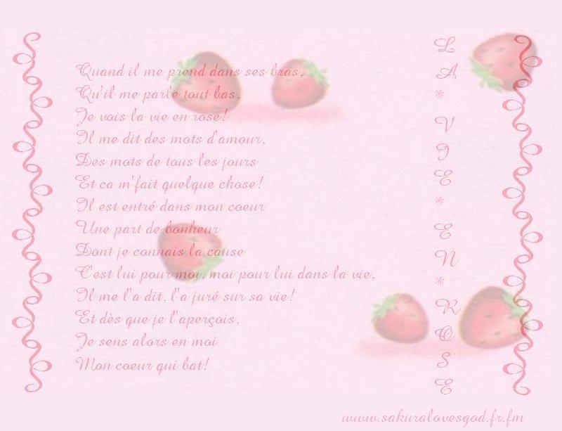
La Vie en Rose (MSpaint/2020) *glomps*
Purple Wing (alternated between purple and blue versions)
Started screencapping and image editing.This layout was half HTML, made from screencaps from episode 40 (my favorite with the cave episode).The organization was coming along well.Mood: mysterious, dark and melancholy.
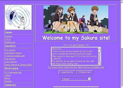
Another much loved layout: an attempt at organization.I started using HTML for the blog and around the site (textareas).Made my own CCS Sakura dollz and Clow Faeries.
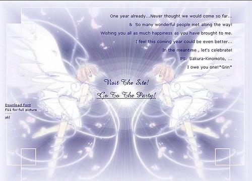
SLG 1 year Birthday splash page, with link to a special recap website with goodies for all visitors and thankyou's for the affies and friend sites ^_^ It was a cool party..i also organized the first contest and gave out about seventy awards ^_^
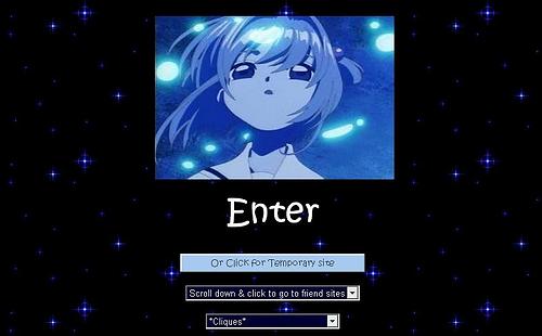
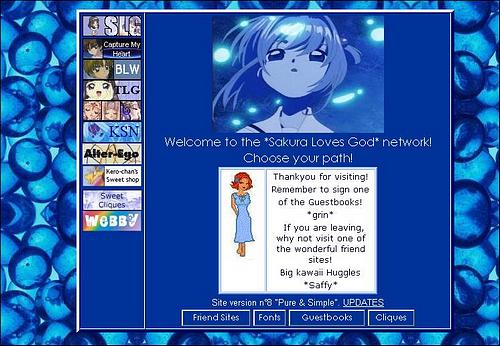
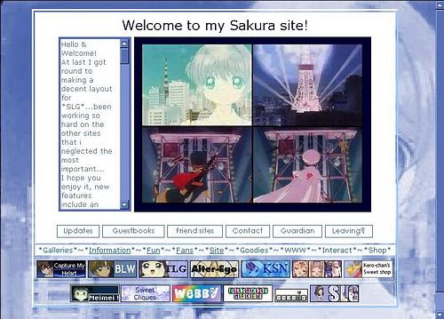
"Pure and Simple Layout" I loved it to bits ^_^ that blue image became my logo, Saffy became a second name, and that avatar was adopted to represent me.Discovered Stylesheets and started with simple rollovers and scrollbars.
First try at making my own layout graphics (in MSpaint) this was a funky layout ^_^
First frames website! the cloud background was changed to black silk after 9/11
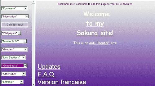
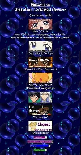
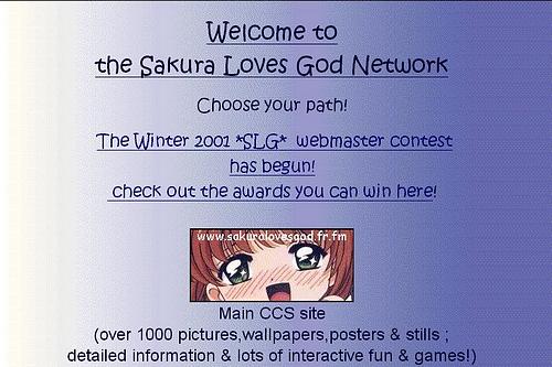
I loved this layout with its purple gradient, despite the UNpratical drop menus (necessary to keep track of all content - it is at this point that SLG started to span many accounts)
Geocities + Trellix days, image link banners on a tiled background